

Mantine Onboarding Tour v3 - Responsive by Design, Smoother Than Ever
Responsive popover positioning, granular lifecycle callbacks, persistent overlay, and type-safe step definitions — all in one major release.

Introduction
Version 3.0.0 of @gfazioli/mantine-onboarding-tour is a major overhaul that makes guided tours feel polished on every screen size. The responsive system has been completely redesigned around Mantine’s useMatches() pattern, transitions between steps are now seamless, and the API is cleaner and fully type-safe. If you’re building onboarding experiences with Mantine 8, this release is a significant step forward.
What’s New
Responsive Popover Positioning
The old responsive / mobileBreakpoint / mobilePosition toggle has been replaced by something far more powerful: responsive objects on popover props. The position, offset, width, and arrowSize properties now accept breakpoint-to-value maps — the same pattern Mantine uses throughout its ecosystem.
<OnboardingTour
  focusRevealProps={{
    popoverProps: {
      position: { base: 'bottom', sm: 'right' },
      offset: { base: 8, sm: -4 },
      width: { base: 'target', md: 350 },
    },
  }}
/>
Each step can also define its own responsive overrides:
const steps: OnboardingTourStep[] = [
  {
    id: 'sidebar',
    title: 'Sidebar Navigation',
    content: 'Explore the menu items here.',
    focusRevealProps: {
      popoverProps: {
        position: { base: 'bottom', sm: 'right', lg: 'left' },
      },
    },
  },
];
On top of that, Floating UI shift and flip middlewares are now enabled by default — popovers stay within the viewport automatically, no extra configuration needed.
Granular Tour Lifecycle Callbacks
The single onOnboardingTourClose callback has been replaced with three distinct callbacks that let you react differently to how the tour ends:
<OnboardingTour
  onOnboardingTourComplete={() => {
    // User finished all steps — mark as completed
    markTourAsCompleted();
  }}
  onOnboardingTourSkip={() => {
    // User clicked Skip — maybe show later
    markTourAsSkipped();
  }}
  onOnboardingTourEnd={() => {
    // Always fires — close the UI
    setStarted(false);
  }}
/>
The controller also exposes a new skipTour() method for programmatic use in custom popover content.
Persistent Overlay
The backdrop overlay is now rendered once at the OnboardingTour level and stays visible across step transitions. This eliminates the flicker that occurred when the overlay would unmount and remount between steps. Each step can customize the overlay appearance (color, opacity, blur) via focusRevealProps.overlayProps, with smooth CSS transitions between them.
Type-Safe Custom Step Properties
No more [key: string]: any. Custom step properties are now declared via a generic type parameter:
type MyStep = { icon: string; badge?: string };

const steps: OnboardingTourStep<MyStep>[] = [
  { id: 'step1', title: 'Welcome', icon: 'home', badge: 'New' },
];
The generic flows through OnboardingTourController<T>, so you get full autocomplete and type checking in render functions.
Smoother Step Transitions
A new two-phase transition mechanism ensures the current popover closes completely before the next one opens. No more flash of the wrong content during navigation.
Additional Improvements
focusedZIndexprop — Control the z-index of focused elements (default:201)factory()pattern —OnboardingTournow supports Mantine’sfactory()API forrefforwarding and Styles API integrationScroll centering — Target elements are always scrolled to center of the viewport; Floating UI handles the rest
No more horizontal scroll —
overflowX: hiddenis applied to<html>while the tour is active
Breaking Changes
This is a major release with several breaking changes. Here’s a quick overview:
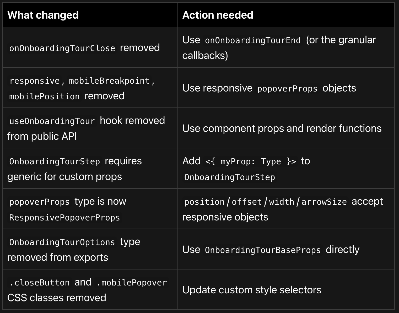
Migration Guide
1. Replace onOnboardingTourClose
The simplest migration — onOnboardingTourEnd is a drop-in replacement:
// v2
<OnboardingTour onOnboardingTourClose={() => setStarted(false)} />

// v3
<OnboardingTour onOnboardingTourEnd={() => setStarted(false)} />
2. Replace responsive props
// v2
<OnboardingTour responsive mobileBreakpoint="sm" mobilePosition="bottom" />

// v3 — responsive is built-in, no toggle needed
<OnboardingTour
  focusRevealProps={{
    popoverProps: {
      position: { base: 'bottom', sm: 'left' },
    },
  }}
/>
3. Remove useOnboardingTour import
This hook was internal and created isolated state. Use render functions instead:
// v2
import { useOnboardingTour } from '@gfazioli/mantine-onboarding-tour';

// v3 — delete the import, use render functions
<OnboardingTour
  content={(controller) => <div>Step {controller.currentStepIndex}</div>}
/>
4. Add generics for custom step properties
// v2
const steps: OnboardingTourStep[] = [
  { id: 's1', price: 9.99 },
];

// v3
const steps: OnboardingTourStep<{ price: number }>[] = [
  { id: 's1', price: 9.99 },
];
Bug Fixes
Popover content flash — No more brief flash of the next step’s content inside the current popover during transitions
Overlay flickering — Persistent overlay eliminates unmount/remount flicker between steps
Horizontal scroll — Portal-rendered popovers no longer cause horizontal scrollbars
Popover behind overlay — Popovers now render via portal by default, always appearing above the overlay
withinPortalwas locked —popoverPropsnow accepts the fullPopoverPropstype
Links
Documentation: gfazioli.github.io/mantine-onboarding-tour
Mantine: Compatible with Mantine 8.x and React 18/19
Nice!