

Mantine Marquee v3 - CSS Mask Fade Edges, Responsive Props, and GPU-Accelerated Animations
A new CSS mask-image fade engine, responsive layout controls, and ultra-smooth GPU-accelerated marquee animations.

The fade edges system has been completely rebuilt on CSS
mask-image-- background-independent, zero extra DOM nodes, and three distinct mask shapes to choose from.
Introduction
This major release of @gfazioli/mantine-marquee represents the biggest architectural upgrade since the component’s initial release. The entire edge-fading system has been rewritten from scratch: instead of rendering overlay <div> elements with colored gradients, the component now uses CSS mask-image for true alpha compositing that works on any background -- solid colors, gradients, images, or transparent. On top of that, the vertical and gap props are now fully responsive via Mantine’s breakpoint system, and several CSS performance fixes ensure silky-smooth animations across all browsers.
What’s New
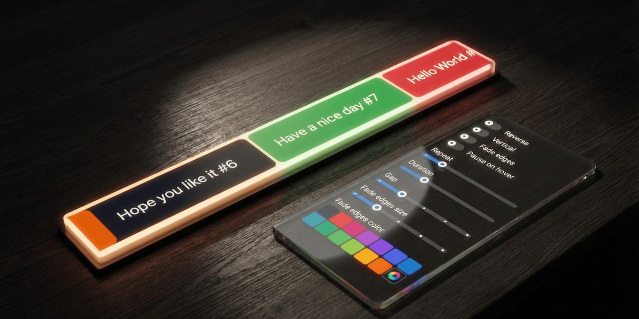
A New Fade Edges System Built on CSS Masks
The fadeEdges prop has evolved from a simple boolean toggle into a union type that lets you choose the exact shape of the fade effect:
// Previously: only boolean
<Marquee fadeEdges>{children}</Marquee>

// Now: choose your mask shape
<Marquee fadeEdges="linear">{children}</Marquee>   // same as fadeEdges={true}
<Marquee fadeEdges="ellipse">{children}</Marquee>  // radial vignette
<Marquee fadeEdges="rect">{children}</Marquee>     // all 4 edges independently
The type signature is:
type MarqueeFadeEdges = boolean | 'linear' | 'ellipse' | 'rect';Passing true still works and maps to "linear", so existing boolean usage is fully backward-compatible.
Why CSS masks? The previous overlay-div approach had a fundamental limitation: the fade color had to match the background. If your page background was a gradient, an image, or simply a different color than what you passed to fadeEdgesColor, the fade edges would look wrong. CSS mask-image performs true alpha compositing at the GPU level -- it masks pixels directly, independent of what is behind them.
Under the hood, the implementation uses one-sided gradients (one per edge) composited with mask-composite: intersect. This was a deliberate choice: a single double-sided gradient (transparent -> black -> transparent) breaks when the fade size exceeds 50% of the container, because the gradient stop positions swap and the browser clamps them per the CSS spec, creating a hard visible seam. One-sided gradients can never have overlapping stops, so they work correctly at any size.
Linear Mode
The classic fade effect: content fades in on the leading edge and fades out on the trailing edge. In vertical mode, the gradients switch from left/right to top/bottom automatically.
import { Marquee } from '@gfazioli/mantine-marquee';

function Demo() {
  return (
    <Marquee fadeEdges="linear" fadeEdgesSize="sm">
      <Box bg="blue" p="md" c="white">Item 1</Box>
      <Box bg="cyan" p="md" c="white">Item 2</Box>
      <Box bg="indigo" p="md" c="white">Item 3</Box>
    </Marquee>
  );
}
Ellipse Mode
A radial vignette that fades all edges simultaneously, creating a spotlight effect. The ellipse uses closest-side sizing so that it adapts naturally to rectangular containers. No orientation variant is needed -- radial gradients are inherently direction-independent.
<Marquee fadeEdges="ellipse" fadeEdgesSize="md" pauseOnHover>
  <ThemeIcon variant="transparent" size="120px">
    <IconBrandGithub style={{ width: '70%', height: '70%' }} />
  </ThemeIcon>
  <ThemeIcon variant="transparent" size="120px">
    <IconBrandMantine style={{ width: '70%', height: '70%' }} />
  </ThemeIcon>
  {/* ... */}
</Marquee>
On a square element (where width equals height), the ellipse naturally produces a circular mask -- no additional props are required.
Rect Mode
Fades all four edges independently, with separate control over horizontal and vertical fade extent. This is where the new [x, y] tuple support for fadeEdgesSize really shines:
{/* Uniform fade on all 4 edges */}
<Marquee fadeEdges="rect" fadeEdgesSize="md" h={60}>
  {children}
</Marquee>

{/* More fade on left/right (lg), less on top/bottom (xs) */}
<Marquee fadeEdges="rect" fadeEdgesSize={['lg', 'xs']} h={60}>
  {children}
</Marquee>
At corners, the alpha values multiply naturally (e.g. 0.5 x 0.5 = 0.25), producing smooth diagonal falloff with no special handling needed.
Tuple Support for fadeEdgesSize
The fadeEdgesSize prop now accepts an [x, y] tuple for independent axis control:
type MarqueeFadeEdgesSize =
  | MantineSize          // 'xs' | 'sm' | 'md' | 'lg' | 'xl'
  | (string & {})        // any CSS value
  | [x, y];             // tuple: [horizontal, vertical]
A single value applies uniformly to all edges. A tuple lets you set different sizes for horizontal (x = left/right) and vertical (y = top/bottom) fading. The tuple maps to two new CSS custom properties: --marquee-fade-edge-size-x and --marquee-fade-edge-size-y.
Responsive vertical Prop
The vertical prop now accepts a Mantine breakpoint object, enabling layout that switches between vertical and horizontal scrolling at different viewport widths:
<Marquee vertical={{ base: true, md: false }} h={300} fadeEdges>
  <Box bg="blue" p="md" c="white">Item 1</Box>
  <Box bg="cyan" p="md" c="white">Item 2</Box>
  <Box bg="indigo" p="md" c="white">Item 3</Box>
</Marquee>
In this example, the marquee scrolls vertically on small screens and switches to horizontal at the md breakpoint. Plain boolean values continue to work as before.
type MarqueeVertical = boolean | Partial<Record<MantineBreakpoint, boolean>>;Responsive gap Prop
Similarly, the gap prop now accepts a responsive breakpoint object:
<Marquee gap={{ base: 'xs', md: 'xl' }} fadeEdges="linear">
  <Box bg="blue" p="md" c="white">Item 1</Box>
  <Box bg="cyan" p="md" c="white">Item 2</Box>
  <Box bg="indigo" p="md" c="white">Item 3</Box>
</Marquee>
This gives you tight spacing on mobile and generous spacing on larger screens, without any custom CSS or media queries.
type MarqueeGap =
  | MantineSize
  | (string & {})
  | Partial<Record<MantineBreakpoint, MantineSize | (string & {})>>;
New Exported Types
Four new TypeScript types are exported from the package, making it easier to type your own wrapper components:
MarqueeFadeEdges-- the union type forfadeEdgesMarqueeFadeEdgesSize-- the union type (with tuple) forfadeEdgesSizeMarqueeVertical-- the union type for responsiveverticalMarqueeGap-- the union type for responsivegap
import type {
  MarqueeFadeEdges,
  MarqueeFadeEdgesSize,
  MarqueeVertical,
  MarqueeGap,
} from '@gfazioli/mantine-marquee';
Breaking Changes
1. fadeEdgesColor Prop Removed
The fadeEdgesColor prop has been completely removed. The new CSS mask system is background-independent -- it does not need to know the background color.
Before:
<Marquee fadeEdges fadeEdgesColor="dark.7">
  {children}
</Marquee>
After:
<Marquee fadeEdges>
  {children}
</Marquee>
Simply remove the fadeEdgesColor prop. The fade effect now works correctly on any background.
2. fadeEdges Type Changed
While fadeEdges={true} and the shorthand fadeEdges continue to work exactly as before, the TypeScript type is now a union. If your wrapper component declares fadeEdges?: boolean, update it:
// Before
fadeEdges?: boolean;

// After
fadeEdges?: MarqueeFadeEdges;
// or inline: boolean | 'linear' | 'ellipse' | 'rect'
3. CSS Custom Properties Removed from Styles API
The following CSS variables have been removed from MarqueeCssVariables and are no longer available via the vars prop:
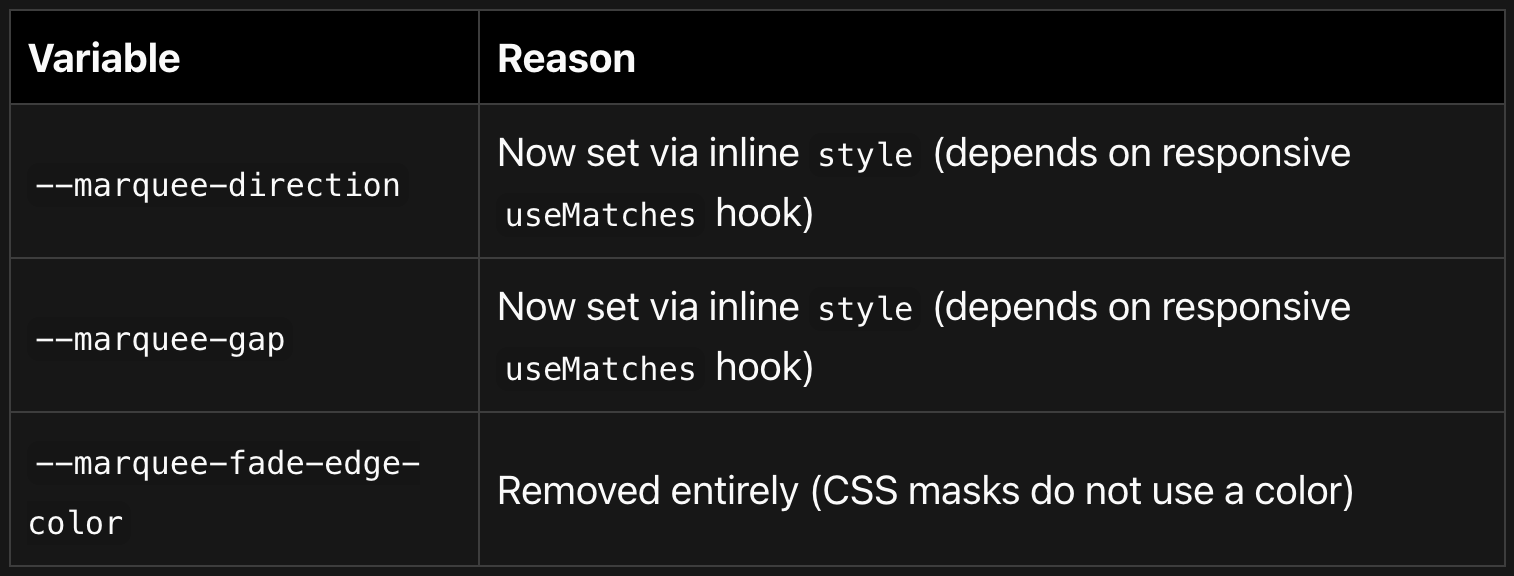
If you were overriding these through the Styles API vars prop, use the component props instead:
// Before: overriding via vars
<Marquee vars={{ root: { '--marquee-gap': '2rem' } }}>
  {children}
</Marquee>

// After: use the gap prop directly
<Marquee gap="2rem">
  {children}
</Marquee>
4. Internal Overlay CSS Selectors Removed
The internal CSS classes .marqueeFadeEdgeLeft, .marqueeFadeEdgeRight, .marqueeFadeEdgeTop, and .marqueeFadeEdgeBottom no longer exist in the DOM. If you were targeting these with custom CSS, the fade is now controlled entirely through mask-image on the .root element. Customize the fade extent via the fadeEdgesSize prop or the --marquee-fade-edge-size* CSS custom properties.
Performance Improvements
GPU compositor layer promotion -- Added
will-change: transformandbackface-visibility: hiddento all animated clone wrappers. This tells the browser to promote each element to a dedicated GPU layer, preventing frame drops and eliminating the flicker visible on Safari/iOS during keyframe animation loop resets.Removed duplicate stacking context --
overflow: hiddenwas previously set on both.rootand.marqueeContainer. The double declaration created an extra stacking context that could interfere with GPU layer compositing. It is now only on.root.Zero additional DOM nodes for fade edges -- The old system rendered 2-4 absolutely-positioned
<div>elements. The CSSmask-imageapproach achieves the same visual effect with no extra DOM nodes at all.
Bug Fixes
Fixed a triple-dash typo in CSS variable fallback (
---marquee-gap-xlcorrected to--marquee-gap-xl) that caused the gap to always fall through to the hardcoded16pxfallback.Fixed
justify-content: space-aroundin.marqueeContenttoflex-start. The previous value distributed extra space between clones, breaking the seamless loop geometry.Fixed missing
useMemodependencies (gap,duration) that prevented runtime prop changes from regenerating clone keys.Fixed
libraryValuemismatches in the configurator demo that showed incorrect “changed” indicators.Fixed missing import statements in documentation code snippets (
ReactNode,Box,Flex,ThemeIcon) so that users can copy and paste them correctly.
Styles API Reference
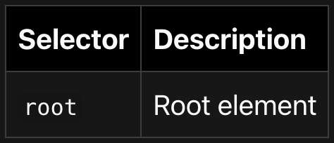
Selectors
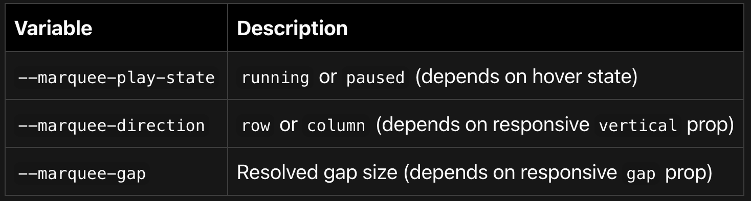
CSS Variables (set via varsResolver)
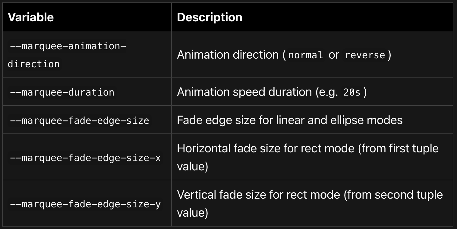
CSS Variables (set via inline style, runtime-dependent)
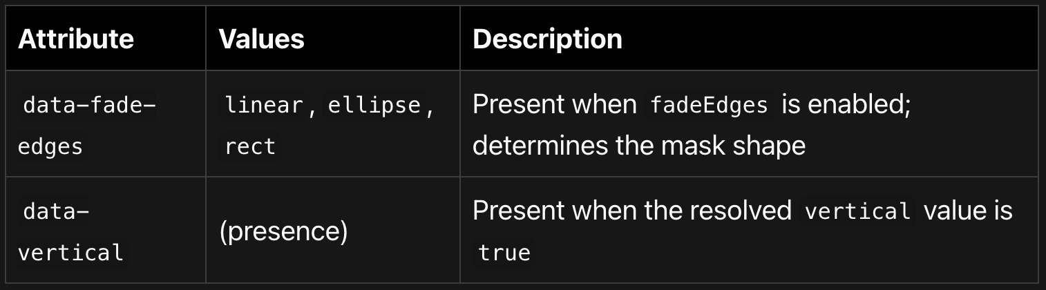
Data Attributes
Getting Started
Installation
npm install @gfazioli/mantine-marquee
# or
yarn add @gfazioli/mantine-marquee
Make sure you have @mantine/core and @mantine/hooks (>= 7.0.0) installed as peer dependencies.
Basic Usage
import { Marquee } from '@gfazioli/mantine-marquee';
import '@gfazioli/mantine-marquee/styles.css';

function Demo() {
  return (
    <Marquee fadeEdges="linear" fadeEdgesSize="sm" pauseOnHover>
      <div>Item 1</div>
      <div>Item 2</div>
      <div>Item 3</div>
      <div>Item 4</div>
    </Marquee>
  );
}
Migration from v2
Remove all
fadeEdgesColorprops -- they are no longer needed.If you were overriding
--marquee-gapor--marquee-directionvia thevarsprop, switch to using thegapandverticalprops directly.If you have custom CSS targeting
.marqueeFadeEdgeLeft/.marqueeFadeEdgeRight/ etc., remove it and usefadeEdgesSizeor the--marquee-fade-edge-size*CSS custom properties instead.If your TypeScript wrapper types used
fadeEdges?: boolean, update tofadeEdges?: MarqueeFadeEdges.
All other existing usage (including fadeEdges={true}, fadeEdges shorthand, fadeEdgesSize="md", and plain vertical={true} / gap="xl") works without any changes.