

Mantine BorderAnimate: Light up your UI with elegant, high‑performance animated borders
Elegant animated borders for Mantine — customizable, performant, and effortless.

Elevate your React interfaces with BorderAnimate, a polished Mantine extension that wraps any element—cards, buttons, inputs, alerts—and adds stunning, configurable border animations without sacrificing performance. If you’re building with Next.js and TypeScript and already rely on Mantine UI, this component feels like a natural superpower upgrade to your design system.
Why BorderAnimate belongs in modern Mantine projects
Visual feedback and motion are essential to contemporary UI. BorderAnimate delivers a carefully engineered set of animation variants that draw attention tastefully—perfect for highlights, CTAs, focus states, and premium surfaces—while keeping your app buttery smooth via CSS animations at 60fps.

Installation is straightforward, theming is intuitive, and the API aligns perfectly with Mantine’s props-driven ergonomics.
Quick start
Add styles at your app root:
import ‘@gfazioli/mantine-border-animate/styles.css’;
// or scoped layer version:
import ‘@gfazioli/mantine-border-animate/styles.layer.css’;
Wrap any content:
import { BorderAnimate } from ‘@gfazioli/mantine-border-animate’;
import { Flex, Title, Text } from ‘@mantine/core’;

export function Demo() {
  return (
    <BorderAnimate w={500} h={400}>
      <Flex
        flex={1}
        direction=”column”
        align=”center”
        justify=”center”
        h=”100%”
        style={{ borderRadius: ‘inherit’, backgroundColor: ‘var(--mantine-color-default)’ }}
      >
        <Title>Animate Border</Title>
        <Text>This is an example of BorderAnimate component</Text>
      </Flex>
    </BorderAnimate>
  );
}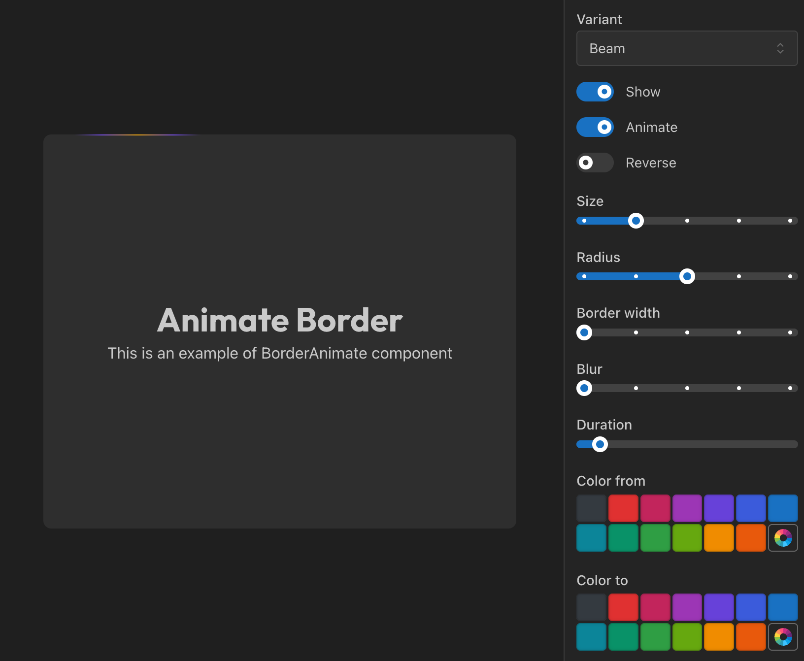
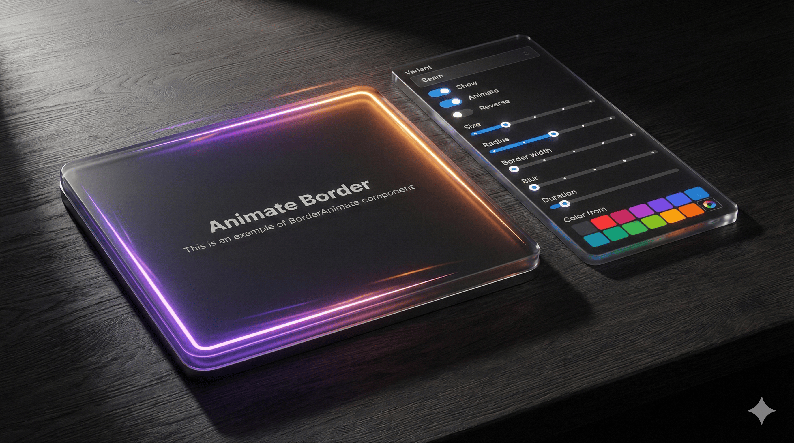
Four variants, endless polish
Beam: a traveling glow that traces your border radius—great for interactive emphasis. Tune with size, anchor, and duration.
Gradient: a rotating conic gradient between colorFrom and colorTo—ideal for premium visuals and loaders. Control duration and blur.
Glow: a gentle pulsation that fills the border area—perfect for notifications or attention states. Adjust duration, blur, opacity.
Pulse: subtle scale + opacity breathing for refined emphasis—minimal yet expressive.
Switch via the variant prop and fine‑tune with props like colorFrom, colorTo, size, blur, duration, border width, radius, and more.
Controlled and predictable
BorderAnimate is fully controllable:
show: toggle border visibility for conditional states.
animate: keep motion on or make it static; combine with angle for directional control.
This makes it effortless to integrate with app state, forms, and feature flags.
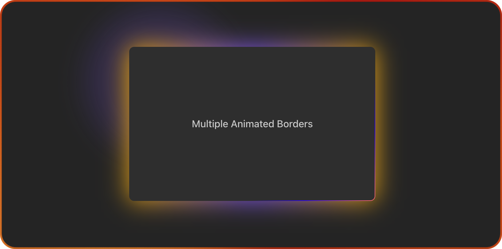
Mask and background effects
For advanced visuals, pair with withMask and zIndex:
withMask=true clips the animation to the border area.
withMask=false lets the glow soft‑spill beyond the element for ambient highlights.
Combine anchor with zIndex={-1} to create tasteful background illumination behind content—beautiful for hero cards, pricing blocks, or featured widgets.
Example:
<BorderAnimate w={200} h={150} withMask={false} size={200} blur={4} anchor={40}>
  {/* content with var(--mantine-radius-md) to match your theme */}
</BorderAnimate>
Built to feel Mantine‑native
BorderAnimate respects Mantine’s design language:
Works with any Mantine component: Paper, Button, Card, Flex, Stack, etc.
Inherits your border radius and colors via CSS custom properties.
Plays nicely with Mantine’s Style Props and Styles API, making theming straightforward and predictable.
Explore Mantine UI’s foundations and best practices here: Mantine UI Getting Started ↗
Perfect for Next.js + TypeScript teams
Type‑safe props and predictable APIs.
Minimal bundle footprint; pure CSS animations for performance.
Drop‑in, componentized design that fits Server Components layouts and client interactivity.
Where it shines in production
Featured product cards and pricing sections that need premium polish.
CTA buttons that warrant subtle motion without distraction.
Focus states for inputs and forms when accessibility needs visual clarity.
Status indicators and alerts that benefit from gentle animated emphasis.
Onboarding moments and spotlight panels using background glow with withMask=false.
Try it, then level up your Mantine stack
Mantine BorderAnimate is part of a growing ecosystem of high‑quality enhancements.
Discover more components tailored for Mantine at the community hub: Mantine Extensions HUB ↗. If you’re standardizing your design system in Next.js, these extensions accelerate UI innovation while staying consistent with Mantine’s principles.
Final thoughts
BorderAnimate adds refined motion to your interfaces with the craftsmanship you expect from Mantine‑aligned components. It’s simple to adopt, delightful to tune, and powerful enough to become a signature detail across your app. Wrap, configure, and let your borders come alive—responsively, accessibly, and beautifully.
Looks cool for landing pages 😎